Sep 2, 2014 Straightsell
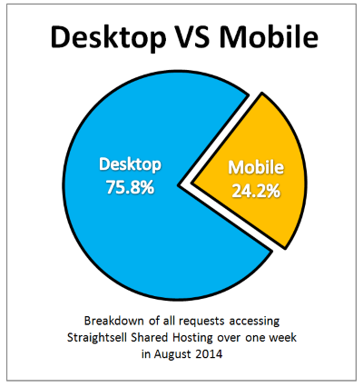
The Straightsell team has gathered data for a one week period in August 2014 and analysed the mobile device traffic coming to our customer's sites. In the four months since our last review there has been little change in the overall proportions desktop and mobile device access, which remains at approximately 75% desktop to 25% mobile.
Regardless of the screen size or form-factor of the web device used to our customer's sites, the Straightsell 'Responsive Web Design' principles ensure our sites will provide a useful and effective interface.
The following information was gathered by analysing all site traffic on the Straightsell shared server cluster for one full week in August 2014.
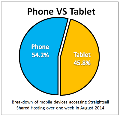
The difference in access volume within the mobile device category between smartphones and tablets has shifted so that phone devices now account for 54% of traffic, up from 51.8% in the last report:
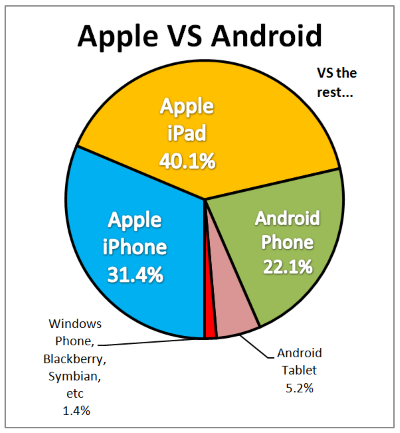
And finally, in the 'battle of the brands', Android devices continue to gain ground, increasing the share of mobile devices to 27%. Apple fell to 72% and the "others" remain irrelevant in the real world, with less than 2% of traffic.