May 6, 2014 Straightsell
Six months have passed since our last article on mobile traffic, Real world Mobile web usage - why we need Responsive Web Design!, and the time has come for an update. As expected, use of smart phones and tablets to access our customer's websites continues to grow, and has now reached 25% of the total traffic.
With some of our customers choosing to upgrade and every new customer implementing the 2014 Straightsell website templates which incorporate 'Responsive Web Design' principles. These website templates are specifically designed to ensure that mobile device website users are given a view of the website that is appropriately sized for the smaller screen and is easy to use via touch interface controls.
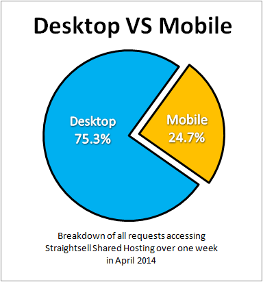
The following information was gathered by analysing all site traffic on the Straightsell shared server cluster for one full week in April 2014.
We found that nearly 25% of all requests to our systems were sent from mobile devices, an increase of 5% from the previous report.
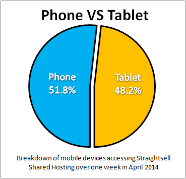
The division within the mobile users between smartphones and tablets remained approximately a 50/50% split:
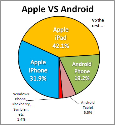
And finally, in the 'battle of the brands', Apple continues its dominance with 74% of the mobile device accesses to our systems coming from Apple devices.