Jan 10, 2014 Straightsell
The continued growth of mobile internet usage is clearly visible every day on the street, on the train, or on the tram; the number of people tapping away on smartphones or tablets now greatly out-numbers those reading books or staring into space. This supports the statements from industry analysts, who have been reporting for years that the consumer mobile web browsing market will come to dominate casual and retail website usage.
As part of our commitment to keep up with (and often stay in front of) industry trends, Straightsell have recently released our new Straightsell Standard 'Responsive Web Design' 2014 eCommerce Website.
Responsive Web Design is the term used for the practice of making flexible, scalable website layouts, that work effectively across all screen sizes, from Desktop computers to tablets and smartphones.
To coincide with our recent launch of the Responsive Web Design website, we decided to conduct research into the mobile device usage that is already occurring for our customer's websites. We analysed all traffic to our shared server cluster for one week during October 2013.
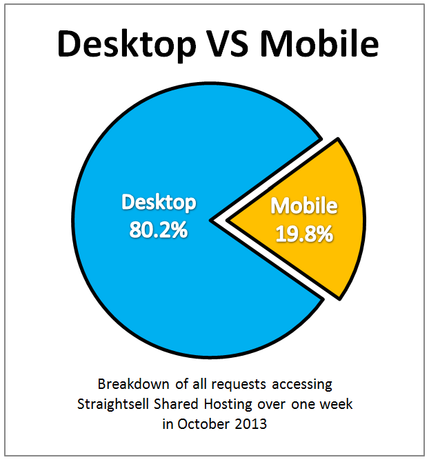
We found that 19.8% of all requests to our systems were sent from mobile devices. Considering the fact that we have a smaller number of retail focused sites and more wholesale distribution websites, the level of mobile device usage is already quite high.
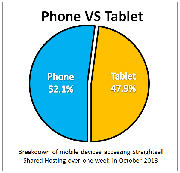
Further breakdown of the system access data yielded the following:
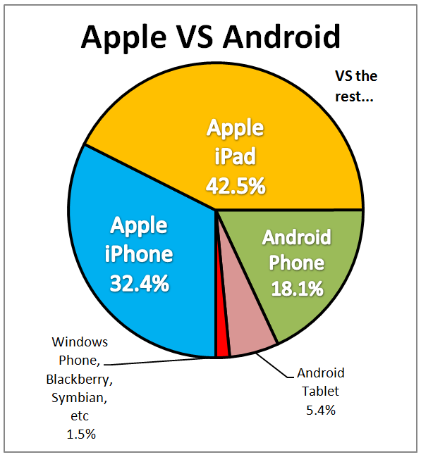
Finally, if we drill into the figures for more detail, we can see that Apple�?� has a considerable lead over Android�?� in market share: 75% to 24%. The remaining players (Windows Phone�?� Blackberry�?� and Nokia�?� Symbian�?� smartphones) combined are a very small proportion of the market.